Saturday, March 31, 2012

Assignment #3

This assignment was really frustrating for me and I am really embarrassed to be showing this to you!
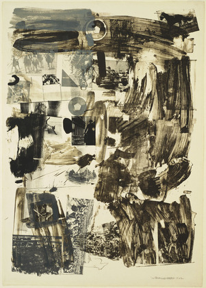
I used dried up acrylic from my pallet and cut it up into pieces to make the face and neck, feathers to make the texture on the right and to put on the person's head and on the bottom right, and I tore out pages from a book, as seen on the left. I learned that medium that is new to you can be very difficult to make it do what you want it to do. I had a really hard time creating an expression on the person's face, and if I messed up, I couldn't go over it--I had to either keep going or completely change it! At first I had fun, I tried not to hesitate but as I kept going, I saw that I could not be as "spontaneous" in working as I am with acrylic paint: I learned that you have to plan more ahead for collages because the layers are more permanent. It was hard to control the layers and paint and as I kept going nothing turned out how I wanted it to. I tried to make it look like a more abstract piece but I personally think it looks like a 5 year old did it. BUT it is something I would like to keep experimenting with, but I would start out practising with simpler mediums.
(Also I experimented with another piece but it fell apart before I took the picture... it turns out that I really need to do a lot more experimenting!!)
Oh! Also, I was inspired by Dr. Seuess's quote: "I like nonsense, it wakes up the brain cells. Fantasy is a necessary ingredient in living. It's a way of looking at life through the wrong end of a telescope. Which is what I do, and that enables you to laugh at life's realities." 
-Dr. Seuss"

Thursday, March 29, 2012

Journal #3

I really liked this one because I liked the fact that there is a recognizable setting, even if it is vague. (At least to me, I recognize the red circle as a sun) I think it's cool that it is the ARTIST'S take on a place, and the emotion I get from it, is lovely but PECULIAR--the "sun" offers a very bright and "certain" object with colour to take in and there is a splatter of black lines and an assortment of bright colours that I think many people could identify as many different things (I picture it as a bunch of colourfully clothed people). In contrast to those bright colours, there is white and tan colours that seem kind of dull compared to it. The mixed media, such as the wood, paint and nails (I think), come together to not necessarily to create something that makes sense right away, but that pulls a sort of thoughtfulness from the audience (if that makes any sense!)

This one caught my eye because I saw silhouettes of people, faces, and more recognizable things (the horse and cat). I like the contrast that is created with only the use of black and white; the white makes it look like it's on a projector and light is going through it. I wonder how big it is!

I like this one for the same reasons as the one above it, but also because it is 3-D. I like the ideas were first created onto each separate slide and then put together to create an entire piece, if looked at at a certain perspective.


I picked these two, because I found a sort of pattern with the colours and how they associated with my reaction to the pieces and the "story" I kind of made up in my head when I saw them. The use of green-ish yellow tints gave me kind of this eery feeling. For example, one of my first thoughts when I saw the one of top was, "Ooh are they having an affair?"

As for these two pieces, I felt like the blue tone gave it not a necessarily "sad" mood but a very thoughtful, reflective, or pensive feeling. I knew colours had an impact on the feeling of the painting, but I had never really thought about so much! I think in most cases, if a certain colour is focused on, then the stronger the emotion is portrayed.


Saturday, March 24, 2012

Module #2

This is my still life portrait! The camera represents that I LOVE taking pictures and capturing things, places and people in a certain moments. I can't go anywhere without my camera. The stuffed animal horse is basically sums up my childhood--my sister and I had two stuffed animals Nuts (my sister's) and Bad-Horsey (mine). We created an entire world with a school system, government, economy and ways of life. The glass perfume represents the vanilla perfume I use, which probably sounds corny but I love the warm and sweet scent, and try to be warm and sweet towards others when they need help, as well. The shoe is there to show how much I love shoes and it is also a boot that I decorated (I bought fabric I liked, cut it up into strips and glued them all over). I tried to draw the actual pieces of fabric all over the shoe but it turned out really bad so I covered it! As for the paintbrush, it represents that I love to constantly paint and create and express myself through art.
I am not really sure how I feel about this one, I struggled a lot with proportions and shading. I feel like the camera doesn't quite fit with rest of the angles and looks a little flat. The shading on Bad-Horsey's face, now that I look at it, looks out of place and not well blended in. I had a really tough time with the perfume bottle; I kept messing up and it got darker and darker so it was harder to fix. I think I feel okay about the shoe; although I couldn't draw the fabric that was on it, it took me a long time to get the proportions of the shoe right before I started the final piece.  I wasn't sure if I should put a shadow behind the still life--there wasn't one there and I'm not sure if not having a shadow makes it fall flat. Also, I think I should've make the line between the objects and the clothe more distinct and darker, to give the shadows more depth.

Thursday, March 22, 2012

Journal #2

In Art History we've learnt about how Science and Art went hand and hand, and I think this is the perfect example of how artists of that time did that. This honestly blew my mind because they knew how the anatomy fit INSIDE the body, which made them SO proportionally accurate and naturalistic/realistic. 

A lot of his work was a little STRANGE to me, and I couldn't quite put my finger on it. I just thought some of the proportions were strange (not that I could do any better!), like as if he went halfway realistic and then a sort of cartoon-ish style for the other half. I liked this one because it reminded me of cartoons from the 1970s and it embodied such a carefree feeling. 

I LOVED this one, because it shows how talented Leonardo di Vinci was in that he could portray emotion with just HANDS. The top one seems delicate, sensitive, because it is cupping around the person's chest/heart, and the hand does not look tense. The hand on the bottom, seems to be supporting the body position, and I can picture someone in that position if they were empathizing or something like that. I really admire that because whenever I try to sketch a hand, they always end up disproportionate and tense, even when the position is relaxed. 

I liked this one because of how simple the piece is; however it still evokes emotion such as strength forging through even the most difficult of times. The upward direction of their faces, their bodies marching forward, and their hair getting blown back gives it a physical power, I think, as well as movement. 


I also like the simplicity in this one because he managed to created an accurately proportionate male figure with very few lines.


Saturday, March 17, 2012

Journal #1

Love/Hate
1.) Big T-shirts/uncomfortable chairs
2.) Happy dogs/wearing jeans
3.) Tall windows/not feeling good enough
4.) Murals in a city/exams
5.) Bear hugs/physics
6.) Road trips/feeling stuck
7.) Letters in the mail/texting constantly
8.) Exploring/just hearing not listening
9.) Butterflies in my stomach/Sunday evenings
10.) Going on a roof/regret

Module #1

(The one on the left got a little messed up, I forgot to put paper in between the pages and some oil pastel from the paper on the right got on it)


Wednesday, March 14, 2012

Longhorn Painting

This is my most recent painting; my English teacher asked me to paint her a longhorn. There are a LOT of layers on the canvas because I kept messing up! I wanted its proportions to be mostly accurate but also alien-like and sort of surreal, as if it were in a desert on a different planet or something. I wanted to make the lines in the texture apparent.

Native American Charcoal

I did this one because I had done paintings of faces head on, but I wanted to try it in charcoal. However, I used two pictures (on the left) to refer to, so I don't think I can use it. I've been practising drawing faces from life (my face, and friends and family) so I can get better and use them in my portfolio. But I have to say, I really really enjoyed doing this one, I really had to study every single detail. Also, my dad knows a Native American and he said he is willing to sit down and let me try to draw him! I'm really excited and I hope I'll be able to do it.

Burning Circus Painting

This one has a lot of different stories and ideas all of sort of mixed up together, partly because it kept changing when I worked on it and turned out way different than I planned/expected!
I wanted to paint a really creepy and old woman who is disappearing, shriveling up into an old, wrinkled person with regrets. It's hard to explain, and I probably sound crazy, but I tried to imagine how to lady felt from the famous National Geographic cover felt (1985 I think??). Even though she appears harsh, I imagine inside she feels hurt, like she is trapped, dying, rotting inside herself.
I made the background dark and completely blue and vague, because I wanted to stay away from make perpendicular lines (like in Pagliacci's Bitter Laughter). I thought our eyes should be drawn to the burning circus, and the setting should be mysterious. 

What A Joke Painting

For this one, I just really really really wanted to paint a face head on. When I  first started painting, I was always scared to paint faces and eyes, so I tried to evoke emotion with the body and its surroundings, but I really just wanted to face my fears (haha) and at least TRY it. 
There isn't really meaning to this one, I wanted to do a mug shot and I honestly just wanted to paint a FACE! His harsh makeup makes him look as if he is a "gloomy clown" but if you look closer, he is actually smiling and his eyes are gentle and soft. It's like he has found who is truly is but he has to continue on being how others see him, but he doesn't care because he's found what makes him happy. He's broken the rules, but doesn't care.
(I painted this right after my art camp)

Still Life #2

This is a charcoal still life I did a little over a week ago. I had set up this entire still life and NOTHING was turning out right, so instead of I focused on this little part of what I had set up. I thought the reflection looked really cool, and it reminded me of M.C. Escher! Doing weird and distorted reflections is definitely something I want to experiment more with, and learn how to add more details.

Pagliacci's Bitter Laughter Painting

I based this off of the opera, "Pagliacci." The opera is about this clown that is in love with a girl, but the girl does not return his love. Instead, she loves another man. The girl travels with Pagliacci in their own little circus, and, in their show, they act out a story about how Pagliacci's character is in love with the girl's character, only she does not return his love. The clown is supposed to be happy but he feels empty and lonely. During a show, he loses it and shows his anger and unhappiness. The crowd thinks it's a part of the show and takes it has a joke.
This painting shows how Pagliacci becomes closer to the girl like how a tree grows towards the sun. But, instead of making it grow, the sun burns the tree down, like the girl broke Pagliacci's heart. His eyes are closed because he only wants to see HER but he is blind to the other beauties in life, like the flower that is growing by his side.

(I did this one a few days before my art camp in July)

The Rage of the Gentleman Painting

This painting is about a monkey who got taken away from its mother when it was a baby and put in a circus and cruelly trained to act like a human. His entire life, this monkey has been angry and lonely and confused, but eventually he forgets that he was once a monkey and gets lost in the world of humans. However, he still has a permanent frown on his face and this constant emptiness hollowing out his heart, but he can't remember why, because he can't remember who he is. So he just continues to smoke, blindly doing what he was trained to do, with an emptiness eating him up inside, and he lets himself disappear.
I made his eyes more focused and as I went farther towards the edges of the canvas, I made it the texture less focused and more hazy because I really want his eyes to be the focal point that you're drawn to. 

The Orphan Painting

For this one, I really had fun mixing colours in weird ways and I used my hands and fingers to create flame-like shadows. I wanted to make the character really frail and not exactly human, with a concave poster and a strange, deer-in-the-headlights sort of expression. I made her lips really thick and I thought of Picasso when I painted her eyes. (There are a couple of paintings that are similar to this one)

Still Life #1

This is a still life I did this year, with charcoal. I chose the items and set them up. I chose the glove and the cushion because they had this sort of used velvet-y texture and the lightbulb because it was so WHITE but still had even whiter reflections (but I'm not really happy with the lightbulb). I really wanted to challenge myself with the vase and putting the trumpet behind it and I ended up having a lot of fun TRYING to imitate it!

Circus Freak Painting

I painted this at an art camp I went to over the summer (2011). I painted it with the idea of circus "freaks" smoking or taking a break in a dark alley after a show. They are weary of others staring at them like they are not human, but all they could do is stare back. I used really loose brush strokes because at my art camp I stopped hesitating and I wasn't afraid to try new things.

Silent Scream Painting

There isn't much of a story to this one--this is honestly how I feel in Video Tech (haha), how I feel about/in school. The short, fat, ANNOYING clown is non-stop nagging the mime, telling him what to do all the time, not letting him breathe, not leaving him alone--not allowing him to grow into who could be because she won't let him make his own mistakes. The mime, who is thin, and worn down, can't say anything back because he has no voice. Inside he is saying SHUT UP SHUT UP SHUT UP you don't know ME, you don't know anything about me, because YOU WON'T LET ME SPEAK. But he can't speak up, he is trapped inside himself and who everyone expects him to be, thus forcing him to sit there and take it even though he can't stand it.